1. Modules
  2. Core

Modules

Core

This is the core package that contains all of the UI and logic to be able to seamlessly connect user's wallets to your app and track the state of those wallets. Onboard no longer contains any wallet specific code, so wallets need to be passed in upon initialization.

TIP

note: Release 2.24.0 moves the default position of the account center from topRight to bottomRight. To reset your application to topRight, include the following when initializing onboard:

          accountCenter: {
      desktop: {
        enabled: true,
        position: 'topRight'
      },
      mobile: {
        enabled: true,
        position: 'topRight'
      }
    }


Install

Install the core module:

All Wallet Modules

If you would like to support all wallets, then you can install all of the wallet modules:

NOTE
  • All wallet modules (except for injected-wallets) require extra dependencies and may require polyfilling the node built in modules for the browser. See the Build Environments section for more info
  • If using React you may be interested in checking out the React Hooks package here - https://www.npmjs.com/package/@web3-onboard/react
  • If using Vue you may be interested in checking out the Vue package here - https://www.npmjs.com/package/@web3-onboard/vue

Quick start

Checkout our full library of quick start examples for connecting and interacting with EVM based wallets

Initialization

Onboard needs to be initialized with an options object before the API can be used:

        type InitOptions {
  wallets: WalletInit[]
  chains: Chain[]
  appMetadata?: AppMetadata
  i18n?: i18nOptions
  accountCenter?: AccountCenterOptions
  apiKey?: string
  notify?: Partial<NotifyOptions>
  gas?: typeof gas
  /**
   * Customize the connect modal
   */
  connect?: ConnectModalOptions
  /**
   * Object mapping for W3O components with the key being the component and the value the DOM element to mount the component to. This element must be available at time of package script execution.
   */
  containerElements?: Partial<ContainerElements>
  /**
   * Custom or predefined theme for Web3Onboard i.e. default, dark, Custom, etc.
   */
  theme?: Theme
  /**
   * Defaults to False
   * If set to true the Inter font will not be imported and
   * instead the default 'sans-serif' font will be used
   * To define the font used see `--w3o-font-family` prop within
   * the Theme initialization object or set as css variable
   */
  disableFontDownload?: boolean
}


wallets

An array of wallet modules that you would like to be presented to the user to select from when connecting a wallet. A wallet module is an abstraction that allows for easy interaction without needing to know the specifics of how that wallet works and are separate packages that can be included. These modules are separate @web3-onboard packages such as @web3-onboard/injected-wallets or @web3-onboard/ledger. For a full list click here.


chains

An array of Chains that your app supports:

        type Chain = {
  id: ChainId // hex encoded string, eg '0x1' for Ethereum Mainnet
  namespace?: 'evm' // string indicating chain namespace. Defaults to 'evm' but will allow other chain namespaces in the future
  // PLEASE NOTE: Some wallets require an rpcUrl, label, and token for actions such as adding a new chain.
  // It is recommended to include rpcUrl, label, and token for full functionality.
  rpcUrl?: string // Recommended to include. Used for network requests.
  label?: string // Recommended to include. Used for display, eg Ethereum Mainnet.
  token?: TokenSymbol // Recommended to include. The native token symbol, eg ETH, BNB, MATIC.
  color?: string // the color used to represent the chain and will be used as a background for the icon
  icon?: string // the icon to represent the chain
  publicRpcUrl?: string // an optional public RPC used when adding a new chain config to the wallet
  blockExplorerUrl?: string // also used when adding a new config to the wallet
  secondaryTokens?: SecondaryTokens[] // An optional array of tokens (max of 5) to be available to the dapp in the app state object per wallet within the wallet account and displayed in Account Center (if enabled)
}

interface SecondaryTokens {
  /**
   * Required - The onchain address of the token associated
   * with the chain it is entered under
   */
  address: string
  /**
   * An optional svg or url string for the icon of the token.
   * If an svg is used ensure the height/width is set to 100%
   */
  icon?: string
}


appMetadata

An object that defines your app:

ts
        type AppMetadata = {
  // app name
  name: string
  // SVG icon string, with height or width (whichever is larger) set to 100% or a valid image URL
  // note: if using an emoji make sure to send base64 string
  // Note: `icon` is displayed on both mobile AND desktop. If `logo`
  // below is provided then `icon` displays on mobile and `logo` on desktop
  icon: string
  // Optional wide format logo (ie icon and text) to be displayed in the sidebar of connect modal. Defaults to icon if not provided
  // Note: This will ONLY display on desktop. It is best used with wide format logos. Use `icon` for standard 40x40 icons.
  logo?: string
  // description of app
  description?: string
  // url to a getting started guide for app
  gettingStartedGuide?: string
  // url that points to more information about app
  explore?: string
  // if your app only supports injected wallets and when no injected wallets detected, recommend the user to install some
  recommendedInjectedWallets?: RecommendedInjectedWallets[]
  // allows for dapps to require users to agree to TOS and privacy policy before connecting a wallet
  agreement?: TermsOfServiceAgreementOptions | null
}

type TermsOfServiceAgreementOptions = {
  // user agrees with exact version of terms and privacy policy
  version: string
  // url that points to the Terms & Conditions of the dapp
  termsUrl?: string
  // url that points to the Privacy policy of the dapp
  privacyUrl?: string
}

type RecommendedInjectedWallets = {
  name: string // display name
  url: string // link to download wallet
}


updateAppMetadata

If you need to update your Application Metadata after initialization, you can call the updateAppMetadata function with the new configuration

        onboard.state.actions.updateAppMetadata({
  logo: `<svg width="100%" height="100%" viewBox="0 0 12 20" fill="none" xmlns="http://www.w3.org/2000/svg"><path d="M0 0L0.0100002 6L4 10L0.0100002 14.01L0 20H12V14L8 10L12 6.01V0H0ZM10 14.5V18H2V14.5L6 10.5L10 14.5Z" fill="#929BED"/>
  </svg>`,
  description: 'Updated Description!'
})


connect

An object that allows for customizing the connect modal layout and behavior

Web3-Onboard connect wallet modal
ts
        type ConnectModalOptions = {
  /**
   * Display the connect modal sidebar - only applies to desktop views
   */
  showSidebar?: boolean
  /**
   * Disabled close of the connect modal with background click and
   * hides the close button forcing an action from the connect modal
   * Defaults to false
   */
  disableClose?: boolean
  /**
   * If set to true, the most recently connected wallet will store in
   * local storage. Then on init, onboard will try to reconnect to
   * that wallet with no modals displayed
   */
  autoConnectLastWallet?: boolean
  /**
   * If set to true, all previously connected wallets will store in
   * local storage. Then on init, onboard will try to reconnect to
   * each wallet with no modals displayed
   */
  autoConnectAllPreviousWallet?: boolean
  /**
   * Customize the link for the `I don't have a wallet` flow shown on the
   * select wallet modal.
   * Defaults to `https://ethereum.org/en/wallets/find-wallet/#main-content`
   */
  iDontHaveAWalletLink?: string
  /**
   * Customize the link for the `Where's My Wallet` info pop up shown on the
   * select wallet modal.
   * Defaults to `https://www.blocknative.com/blog/metamask-wont-connect-web3-wallet-troubleshooting`
   */
  wheresMyWalletLink?: string
  /**
   * Hide the where is my wallet link notice
   */
  hideWhereIsMyWallet?: boolean
  /**
   * @deprecated Has no effect unless `@web3-onboard/unstoppable-resolution`
   * package has been added and passed into the web3-onboard initialization
   * In this case remove the `@web3-onboard/unstoppable-resolution` package
   * to remove unstoppableDomain resolution support
   */
  disableUDResolution?: boolean
}


i18n

An object that defines the display text for different locales. Can also be used to override the default text. To override the default text, pass in an object for the en locale.

        type Locale = string // eg 'en', 'es'
type i18nOptions = Record<Locale, i18n>


To see a list of all of the text values that can be internationalized or replaced, check out the default en file. Onboard is using the ICU syntax for formatting under the hood.

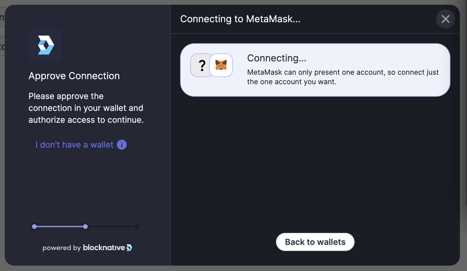
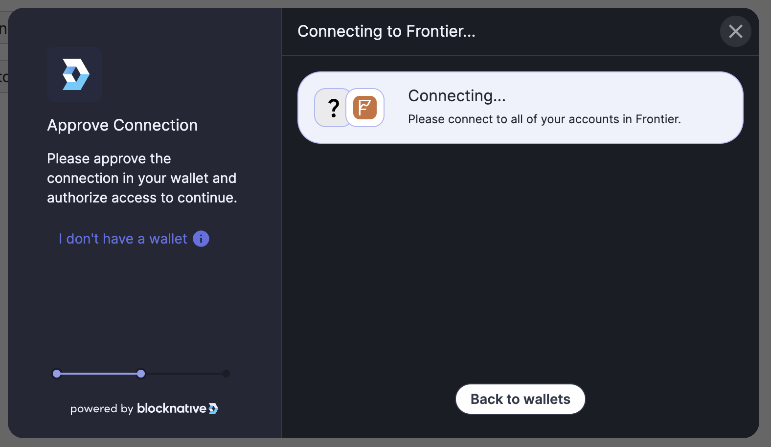
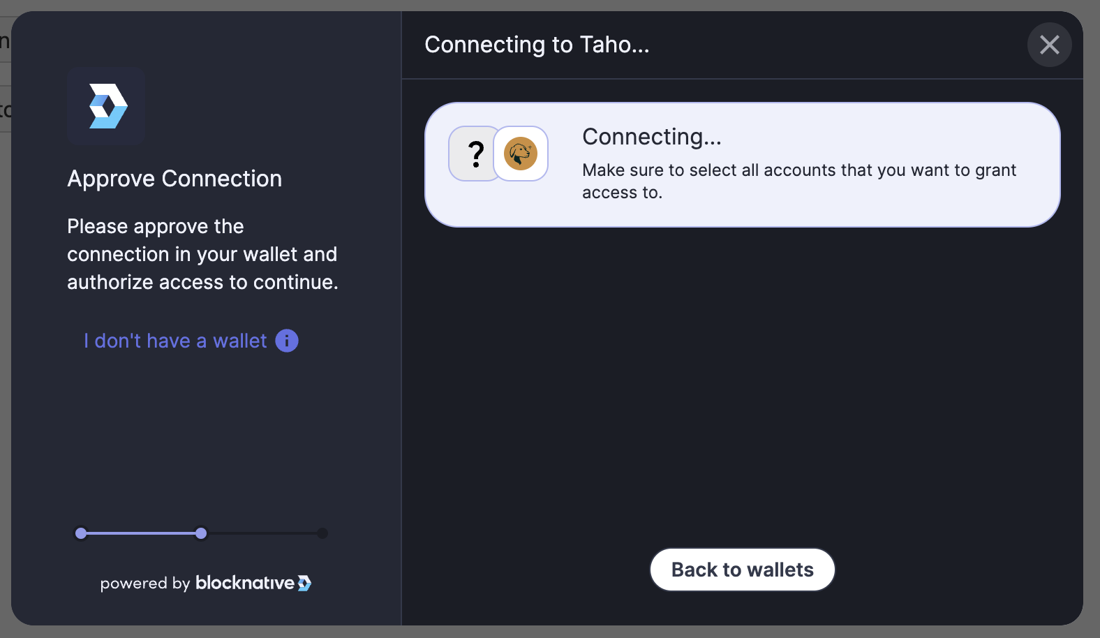
For example, to update the connect interface language for Metamask, while giving a different message for other wallets, you can include the following:

        i18n: {
  en: {
    connect: {
      connectingWallet: {
        paragraph: '{wallet, select, MetaMask {{wallet} can only present one account, so connect just the one account you want.} other {Please connect to all of your accounts in {wallet}.}}'
      }
    }
  }
}


MetaMask message: Web3-Onboard connect wallet modal with custom message

All other wallets: Web3-Onboard connect wallet modal with custom message

Default Message- with no i18n override: Web3-Onboard connect wallet modal with default message

theme

A string or an object that defines the color theme web3-onboard will render the components.

Define a custom or predefined theme for Web3Onboard using either:

Native themes available
'default' a mix of light and dark elements found throughout the web3-onboard components
'dark' modern look - easy on the eyes in low-light settings
'light' bright and clean look - easier to read in bright environments
'system' automatically switch between 'dark' & 'light' based on the user's system settings
ThemingMap object - Create a totally custom theme see below for the typing.

For a complete walkthrough on customizing your theme checkout our theming documentation

        type Theme = ThemingMap | BuiltInThemes | 'system'

type BuiltInThemes = 'default' | 'dark' | 'light'

type ThemingMap = {
  '--w3o-background-color'?: string
  '--w3o-font-family'?: string
  '--w3o-foreground-color'?: string
  '--w3o-text-color'?: string
  '--w3o-border-color'?: string
  '--w3o-action-color'?: string
  '--w3o-border-radius'?: string
}

      
TIP

Interested in seeing how web3-onboard will look on your site?

Try out our theming tool or our in depth theming walkthrough here

It will allow you to customize the look and feel of web3-onboard, try different themes or create your own, and preview how web3-onboard will look on your site by entering a URL or adding a screenshot.


disableFontDownload

If set to true the default Inter font will not be imported and instead the web based sans-serif font will be used if a font is not defined through the Theme or exposed css variable. To define the font use --w3o-font-family prop within the Theme initialization object or set as a css variable.

        type disableFontDownload = boolean // defaults to false


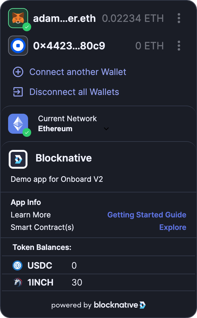
accountCenter

An object that defines whether the account center UI (default and minimal) is enabled and its position on the screen. Currently the account center is enabled for both desktop and mobile devices.
Web3-Onboard Account Center example
        type AccountCenter = {
  enabled: boolean
  position?: AccountCenterPosition // default: 'bottomRight'
  expanded?: boolean // default: true
  minimal?: boolean // enabled by default for mobile
  /**
   * false by default - This allows removal of the
   * Enable Transaction Protection' button within the Account Center
   * expanded when set to true
   * Can be set as a global for Account Center or per interface (desktop/mobile)
   */
  hideTransactionProtectionBtn?: boolean
  /**
   * @deprecated Use top level containerElements property
   * with the accountCenter prop set to the desired container El. See documentation below
   */
  containerElement?: string // defines the DOM container element for svelte to attach
}

type AccountCenterOptions = {
  desktop: Omit<AccountCenter, 'expanded'>
  mobile: Omit<AccountCenter, 'expanded'>
  /**
   * false by default - This allows removal of the
   * Enable Transaction Protection' button within the Account Center
   * expanded when set to true
   * Can be set as a global for Account Center or per interface (desktop/mobile)
   */
  hideTransactionProtectionBtn?: boolean
}

type AccountCenterPosition = 'topRight' | 'bottomRight' | 'bottomLeft' | 'topLeft'


containerElements

An object mapping for W3O components with the key being the DOM element to mount the specified component to. This defines the DOM container element for svelte to attach the component.

NOTE: containerElement must be a DOM element with a styleSheet property attached and the element must be available on the DOM at the time of component mounting. For an example please see containerElement usage here

        type ContainerElements = {
  /** When attaching the Connect Modal to a container el be aware that
   * the modal was styled to be mounted through the app to the html body
   * and will respond to screen width rather than container width
   * This is specifically apparent on mobile so please test thoroughly
   * Also consider that other DOM elements(specifically Notifications and
   * Account Center) will also append to this DOM el if enabled and their
   * own containerEl are not defined
   */
  connectModal?: string
  /** when using the accountCenter with a container el the accountCenter
   * position properties are ignored
   */
}


notify

Notify is a feature that provides transaction notifications for all connected wallets on the current blockchain. This document will provide you with an overview of Notify and guide you through the process of integrating it into your decentralized application (DApp).
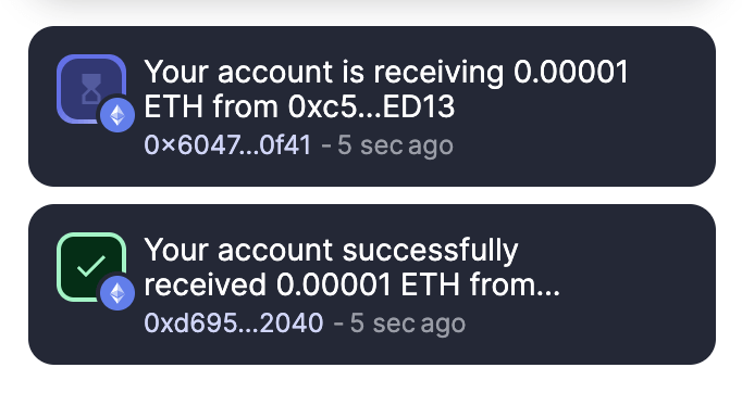
Transaction notifications image

To enable transaction notifications and updates simply add your Blocknative apiKey( sign up for free) to the web3-onboard configurations as the value to the apiKey prop and thats it! Transaction notifications will be shown for all transactions occurring on supported chains for all of the users connected wallets. When switching chains, the previous chain listeners remain active for 60 seconds to allow the capture and report of any remaining transactions that may be in flight.

Notifications are by default positioned in the same location as the Account Center (if enabled) or can be positioned separately using the position property.

Notify Configuration
Property Type Description
enabled boolean Indicates whether transaction notifications will be displayed
transactionHandler function Optional callback for customizations of notifications
position CommonPositions Position of the notification on the screen
Position Options
Property Type Description
desktop Notify Configuration for desktop notifications.
mobile Notify Configuration for mobile notifications.

Both desktop and mobile configurations are of type Notify.

Transaction Handler

The transactionHandler is a callback that receives an object of type EthereumTransactionData. Based on the data received, the handler can return a custom Notification object or a boolean value (false to disable the notification for the current event or undefined for a default notification).

Customizing Notification
Property Type Description
message string Customizes the message shown
eventCode string Allows handling codes in a custom way
type string Represents the icon type displayed
autoDismiss number Time (in ms) after which the notification will be dismissed
link string Adds a link to the transaction hash
onClick function onClick handler for the notification element
Styling Notify

Notify automatically will match the theme defined in the web3-onboard config. It can also be styled using the exposed css variables provided below. These variables allow for maximum customization with base styling variables setting the global theme (e.g., --onboard-grey-600) and more precise component-level styling variables available (--notify-onboard-grey-600). The latter takes precedence if defined.

Handling Notifications

If notifications are enabled, they can be fielded and handled through the onboard app state as seen in the example below - although this is not required for notifications to display:

        const wallets = onboard.state.select('notifications')
const { unsubscribe } = wallets.subscribe((update) =>
  console.log('transaction notifications: ', update)
)

// unsubscribe when updates are no longer needed
unsubscribe()

      
Notifications as Toast Messages

The Notifications messages can also be used to send fully customized Dapp toast messages and updated. Check out the customNotifications API docs for examples and code snippets

        type NotifyOptions = {
  desktop: Notify
  mobile: Notify
}
type Notify = {
  enabled: boolean // default: true
  /**
   * Callback that receives all transaction events
   * Return a custom notification based on the event
   * Or return false to disable notification for this event
   * Or return undefined for a default notification
   */
  transactionHandler?: (event: EthereumTransactionData) => TransactionHandlerReturn
  position: CommonPositions
}

type CommonPositions = 'topRight' | 'bottomRight' | 'bottomLeft' | 'topLeft'

type TransactionHandlerReturn = CustomNotification | boolean | void

type CustomNotification = Partial<Omit<Notification, 'id' | 'startTime'>>

type Notification = {
  id: string
  key: string
  network: Network
  startTime?: number
  /**
   * to completely customize the message shown
   */
  message: string
  /**
   * handle codes in your own way - see codes here under the notify prop [default en file here](https://github.com/blocknative/web3-onboard/blob/develop/packages/core/src/i18n/en.json)
   */
  eventCode: string
  /**
   * icon type displayed (see `NotificationType` below for options)
   */
  type: NotificationType
  /**
   * time (in ms) after which the notification will be dismissed. If set to `0` the notification will remain on screen until the user dismisses the notification, refreshes the page or navigates away from the site with the notifications
   */
  autoDismiss: number
  /**
   * add link to the transaction hash. For instance, a link to the transaction on etherscan
   */
  link?: string
  /**
   * onClick handler for when user clicks the notification element
   */
  onClick?: (event: Event) => void
}

type NotificationType = 'pending' | 'success' | 'error' | 'hint'

export declare type Network = 'main' | 'goerli' | 'matic-main' | 'matic-mumbai' | 'local'

export interface UpdateNotification {
  (notificationObject: CustomNotification): {
    dismiss: () => void
    update: UpdateNotification
  }
}


Initialization Example

Putting it all together, here is an example initialization with the injected wallet modules:

ts
        import Onboard from '@web3-onboard/core'
import injectedModule from '@web3-onboard/injected-wallets'

const injected = injectedModule()

const onboard = Onboard({
  // head to https://explorer.blocknative.com/account to sign up for free
  apiKey: 'xxx387fb-bxx1-4xxc-a0x3-9d37e426xxxx'
  wallets: [injected],
  chains: [
    {
      id: '0x1',
      token: 'ETH',
      label: 'Ethereum Mainnet',
      rpcUrl: `https://mainnet.infura.io/v3/${INFURA_ID}`
    },
    {
      id: '0x5',
      token: 'ETH',
      label: 'Goerli',
      rpcUrl: `https://goerli.infura.io/v3/${INFURA_ID}`
    },
    {
      id: 11155111,
      token: 'ETH',
      label: 'Sepolia',
      rpcUrl: 'https://rpc.sepolia.org/'
    },
    {
      id: '0x38',
      token: 'BNB',
      label: 'Binance Smart Chain',
      rpcUrl: 'https://bsc-dataseed.binance.org/'
    },
    {
      id: '0x89',
      token: 'MATIC',
      label: 'Matic Mainnet',
      rpcUrl: 'https://matic-mainnet.chainstacklabs.com'
    },
    {
      id: 10,
      token: 'OETH',
      label: 'Optimism',
      rpcUrl: 'https://mainnet.optimism.io'
    },
    {
      id: 42161,
      token: 'ARB-ETH',
      label: 'Arbitrum',
      rpcUrl: 'https://rpc.ankr.com/arbitrum'
    },
    {
      id: 84531,
      token: 'ETH',
      label: 'Base Goerli',
      rpcUrl: 'https://goerli.base.org'
    }
  ],
  appMetadata: {
    name: 'Token Swap',
    icon: myIcon, // svg string icon
    logo: myLogo, // svg string logo
    description: 'Swap tokens for other tokens',
    recommendedInjectedWallets: [
      { name: 'MetaMask', url: 'https://metamask.io' },
      { name: 'Coinbase', url: 'https://wallet.coinbase.com/' }
    ]
  },
  notify: {
    desktop: {
      enabled: true,
      transactionHandler: transaction => {
        console.log({ transaction })
        if (transaction.eventCode === 'txPool') {
          return {
            type: 'success',
            message: 'Your transaction from #1 DApp is in the mempool',
          }
        }
      },
      position: 'bottomLeft'
    },
    mobile: {
      enabled: true,
      transactionHandler: transaction => {
        console.log({ transaction })
        if (transaction.eventCode === 'txPool') {
          return {
            type: 'success',
            message: 'Your transaction from #1 DApp is in the mempool',
          }
        }
      },
      position: 'topRight'
    }
  },
  accountCenter: {
    desktop: {
      position: 'topRight',
      enabled: true,
      minimal: true
    },
    mobile: {
      position: 'topRight',
      enabled: true,
      minimal: true
    }
  },
  i18n: {
    en: {
      connect: {
        selectingWallet: {
          header: 'custom text header'
        }
      },
      notify: {
        transaction: {
          txStuck: 'custom text for this notification event'
        },
        watched: {
          // Any words in brackets can be re-ordered or removed to fit your dapps desired verbiage
          "txPool": "Your account is {verb} {formattedValue} {asset} {preposition} {counterpartyShortened}"
        }
      }
    },
    es: {
      transaction: {
        txRequest: 'Su transacción está esperando que confirme'
      }
    }
  }
})


Connecting a Wallet

To initiate a user to select and connect a wallet you can call the connectWallet function on an initialized Onboard instance. It will return a Promise that will resolve when the user either successfully connects a wallet, or when they dismiss the UI. The resolved value from the promise will be the latest state of the wallets array. The order of the wallets array is last to first, so the most recently selected wallet will be the first item in the array and can be thought of as the "primary wallet". If no wallet was selected, then the wallets array will have the same state as it had before calling connectWallet.

Example

        async function connectWallet() {
  const wallets = await onboard.connectWallet()
  console.log(wallets)
}

connectWallet()


Auto Selecting a Wallet

A common UX pattern is to remember the last wallet that a user has previously connected by storing it in localStorage and then automatically selecting them for the user next time they visit your app. You can enable this in your app by using the autoConnectLastWallet parameter when initializing and Onboard will take care of it:

        const onboard = Onboard({
  // ... other options
  connect: {
    autoConnectLastWallet: true
  }
})


Disconnecting a Wallet

A wallet can be disconnected, which will cleanup any background operations the wallet may be doing and will also remove it from the Onboard wallets array:

js
        // disconnect the first wallet in the wallets array
const [primaryWallet] = onboard.state.get().wallets
await onboard.disconnectWallet({ label: primaryWallet.label })


The disconnectWallet method takes the wallet.label value and returns a Promise that resolves to the current state of the wallets array.

State

Onboard currently keeps track of the following state:

  • wallets: The wallets connected to Onboard
  • chains: The chains that Onboard has been initialized with
  • accountCenter: The current state of the account center UI
  • walletModules: The wallet modules that are currently set and will be rendered in the wallet selection modal
        type AppState = {
  wallets: WalletState[]
  chains: Chain[]
  accountCenter: AccountCenter
  walletModules: WalletModule[]
  locale: Locale
  notify: Notify
  notifications: Notification[]
}

type Chain {
  namespace?: 'evm'
  id: ChainId
  rpcUrl: string
  label: string
  token: TokenSymbol
  color?: string
  icon?: string
}

type WalletState = {
  label: string
  icon: string
  provider: EIP1193Provider
  accounts: Account[]
  chains: ConnectedChain[]
  instance?: unknown
}

type Account = {
  address: string
  ens: {
    name?: string
    avatar?: string
    contentHash?: string
    getText?: (key: string) => Promise<string | undefined>
  }
  balance: Record<TokenSymbol, string>
}

type ConnectedChain = {
  namespace: 'evm'
  id: ChainId
}

type ChainId = string
type TokenSymbol = string

type AccountCenter = {
  enabled: boolean
  position: AccountCenterPosition
  expanded: boolean
  minimal: boolean
}

type AccountCenterPosition =
  | 'topRight'
  | 'bottomRight'
  | 'bottomLeft'
  | 'topLeft'

type WalletModule {
  label: string
  getIcon: () => Promise<string>
  getInterface: (helpers: GetInterfaceHelpers) => Promise<WalletInterface>
}


Get Current State

The current state of Onboard can be accessed at any time using the state.get() method:

js
        const currentState = onboard.state.get()


Subscribe to State Updates

State can also be subscribed to using the state.select() method. The select method will return an RXJS Observable. Understanding of RXJS observables is not necessary to subscribe to state updates, but allows for composable functionality if wanted. The key point to understand is that if you subscribe for updates, remember to unsubscribe when you are finished to prevent memory leaks.

To subscribe to all state updates, call the select method with no arguments:

js
        const state = onboard.state.select()
const { unsubscribe } = state.subscribe((update) => console.log('state update: ', update))

// remember to unsubscribe when updates are no longer needed
// unsubscribe()


Specific top level slices of state can be subscribed to. For example you may want to just subscribe to receive updates to the wallets array only:

js
        const wallets = onboard.state.select('wallets')
const { unsubscribe } = wallets.subscribe((update) => console.log('wallets update: ', update))

// unsubscribe when updates are no longer needed
unsubscribe()


Actions to Modify State

A limited subset of internal actions are exposed to update the Onboard state.


setWalletModules

For updating the wallets that are displayed in the wallet selection modal. This can be used if the wallets you want to support is conditional on another user action within your app. The setWalletModules action is called with an updated array of wallets (the same wallets that are passed in on initialization)

        import Onboard from '@web3-onboard/core'
import injectedModule from '@web3-onboard/injected-wallets'
import ledgerModule from '@web3-onboard/ledger'
import trezorModule from '@web3-onboard/trezor'

const injected = injectedModule()
const ledger = ledgerModule()
const trezor = trezorModule({
  email: '<EMAIL_CONTACT>',
  appUrl: '<APP_URL>'
})

// initialize with injected and hardware wallets
const onboard = Onboard({
  wallets: [injected, trezor, ledger],
  chains: [
    {
      id: '0x1',
      token: 'ETH',
      label: 'Ethereum Mainnet',
      // Only one RPC required
      rpcUrl:
        `https://mainnet.infura.io/v3/${INFURA_KEY}` ||
        `https://eth-mainnet.g.alchemy.com/v2/${ALCHEMY_KEY}`
    }
  ]
})

// then after a user action, you may decide to only display hardware wallets on the next call to onboard.connectWallet
onboard.state.actions.setWalletModules([ledger, trezor])


updateTheme

An exposed method for updating the theme of web3-onboard. The function accepts Theme types (see below)

The function also accepts a custom built ThemingMap object that contains all or some of the theming variables

Example:

ts
        import Onboard from '@web3-onboard/core'
import injectedModule from '@web3-onboard/injected-wallets'

const injected = injectedModule()

const onboard = Onboard({
  theme: 'dark',
  wallets: [injected],
  chains: [
    {
      id: '0x1',
      token: 'ETH',
      label: 'Ethereum Mainnet',
      rpcUrl: `https://mainnet.infura.io/v3/${INFURA_KEY}`
    }
  ]
})

// after initialization you may want to change the theme based on a theme switch within the dapp
onboard.state.actions.updateTheme('light')
// or
const customTheme: ThemingMap = {
  '--w3o-background-color': '#f0f0f0',
  '--w3o-foreground-color': '#333',
  '--w3o-text-color': '#fff',
  '--w3o-border-color': '#ccc',
  '--w3o-action-color': '#007bff'
}
onboard.state.actions.updateTheme(customTheme)


updateBalances

You may decide to get updated balances for connected wallets after a user action by calling the updatedBalances function, which expects a conditional array of addresses:

        onboard.state.actions.updateBalances() // update all balances for all connected addresses
onboard.state.actions.updateBalances(['0xfdadfadsadsadsadasdsa']) // update balance for one address
onboard.state.actions.updateBalances(['0xfdadfadsadsadsadasdsa', '0xfdsafdsfdsfdsfds']) // update balance for two addresses


setLocale

Onboard will automatically detect the browser locale at runtime, but if you would like to update it manually you can call the setLocale function:

        onboard.state.actions.setLocal('fr_FR')


updateNotify

If you need to update your notify configuration after initialization, you can do that by calling the updateNotify function:

js
        onboard.state.actions.updateNotify({
  desktop: {
    enabled: true,
    transactionHandler: (transaction) => {
      console.log({ transaction })
      if (transaction.eventCode === 'txPool') {
        return {
          type: 'success',
          message: 'Your transaction from #1 DApp is in the mempool'
        }
      }
    },
    position: 'bottomLeft'
  },
  mobile: {
    enabled: true,
    transactionHandler: (transaction) => {
      console.log({ transaction })
      if (transaction.eventCode === 'txPool') {
        return {
          type: 'success',
          message: 'Your transaction from #1 DApp is in the mempool'
        }
      }
    },
    position: 'topRight'
  }
})


customNotification

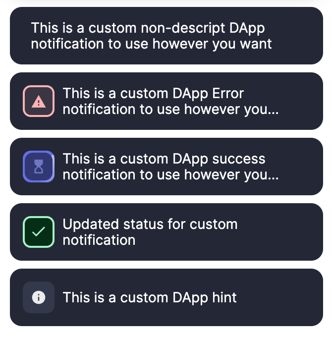
Custom notifications image

Notify can be used to deliver custom DApp notifications by passing a CustomNotification object to the customNotification action. This will return an UpdateNotification type. This UpdateNotification will return an update function that can be passed a new CustomNotification to update the existing notification. The customNotification method also returns a dismiss method that is called without any parameters to dismiss the notification.

Property Type Description
message string Customizes the message shown
eventCode string Allows handling codes in a custom way
type string Represents the icon type displayed
autoDismiss number Time (in ms) after which the notification will be dismissed
link string Adds a link to the transaction hash
onClick function onClick handler for the notification element
js
        <button
  on:click={() =>
    onboard.state.actions.customNotification({
      type: 'hint',
      message: 'This is a custom DApp hint',
      autoDismiss: 0
    })}>Send Hint Notification</button
>
<button
  on:click={() => {
    const { update, dismiss } =
      onboard.state.actions.customNotification({
        type: 'pending',
        message:
          'This is a custom DApp pending notification to use however you want',
        autoDismiss: 0
      })
    setTimeout(
      () =>
        update({
          eventCode: 'dbUpdateSuccess',
          message: 'Updated status for custom notification',
          type: 'success',
          autoDismiss: 0
        }),
      4000
    )
  }}>Send Success Notification</button
>
<button
  on:click={() =>
    onboard.state.actions.customNotification({
      message:
        'This is a custom DApp success notification to use however you want',
      autoDismiss: 0,
      type: 'pending'
    })}>Send Pending Notification</button
>
<button
  on:click={() =>
    onboard.state.actions.customNotification({
      type: 'error',
      message:
        'This is a custom DApp Error notification to use however you want',
      autoDismiss: 0
    })}>Send Error Notification</button
>
<button
  on:click={() =>
    onboard.state.actions.customNotification({
      message:
        'This is a custom non-descript DApp notification to use however you want',
      autoDismiss: 0
    })}>Send DApp Notification</button
>


preflightNotifications

Notify can be used to deliver standard notifications along with preflight updates by passing a PreflightNotificationsOptions object to the preflightNotifications API action.

Preflight notifications image

Preflight event types include:

  • txRequest : Alert user there is a transaction request awaiting confirmation by their wallet
  • txAwaitingApproval : A previous transaction is awaiting confirmation
  • txConfirmReminder : Reminder to confirm a transaction to continue - configurable with the txApproveReminderTimeout property; defaults to 15 seconds
  • nsfFail : The user has insufficient funds for transaction (requires gasPrice, estimateGas, balance, txDetails.value)
  • txError : General transaction error (requires sendTransaction)
  • txSendFail : The user rejected the transaction (requires sendTransaction)
  • txUnderpriced : The gas price for the transaction is too low (requires sendTransaction)

This API call will return a promise that resolves to the transaction hash (if sendTransaction resolves the transaction hash and is successful), the internal notification id (if no sendTransaction function is provided) or return nothing if an error occurs or sendTransaction is not provided or doesn't resolve to a string.

Example:

ts
        const balanceValue = Object.values(balance)[0]
// if using ethers v6 this is:
// ethersProvider = new ethers.BrowserProvider(wallet.provider, 'any')
const ethersProvider = new ethers.providers.Web3Provider(provider, 'any')

const signer = ethersProvider.getSigner()
const txDetails = {
  to: toAddress,
  value: 100000000000000
}

const sendTransaction = () => {
  return signer.sendTransaction(txDetails).then((tx) => tx.hash)
}

const gasPrice = () => ethersProvider.getGasPrice().then((res) => res.toString())

const estimateGas = () => {
  return ethersProvider.estimateGas(txDetails).then((res) => res.toString())
}
const transactionHash = await onboard.state.actions.preflightNotifications({
  sendTransaction,
  gasPrice,
  estimateGas,
  balance: balanceValue,
  txDetails: txDetails
})
console.log(transactionHash)

      
        interface PreflightNotificationsOptions {
  sendTransaction?: () => Promise<string | void>
  estimateGas?: () => Promise<string>
  gasPrice?: () => Promise<string>
  balance?: string | number
  txDetails?: {
    value: string | number
    to?: string
    from?: string
  }
  txApproveReminderTimeout?: number // defaults to 15 seconds if not specified
}


updateAccountCenter

If you need to update your Account Center configuration after initialization, you can call the updateAccountCenter function with the new configuration

        onboard.state.actions.updateAccountCenter({
  position: 'topRight',
  enabled: true,
  minimal: true
})


setPrimaryWallet

The primary wallet (first in the list of connected wallets) and primary account (first in the list of connected accounts for a wallet) can be set by using the setPrimaryWallet function. The wallet that is set needs to be passed in for the first parameter and if you would like to set the primary account, the address of that account also needs to be passed in:

        // set the second wallet in the wallets array as the primary
onboard.state.actions.setPrimaryWallet(wallets[1])

// set the second wallet in the wallets array as the primary wallet
// as well as setting the third account in that wallet as the primary account
onboard.state.actions.setPrimaryWallet(wallets[1], wallets[1].accounts[2].address)


Setting the User's Chain/Network

When initializing Onboard you define a list of chains/networks that your app supports. If you would like to prompt the user to switch to one of those chains, you can use the setChain method on an initialized instance of Onboard:

ts
        type SetChain = (options: SetChainOptions) => Promise<boolean>
type SetChainOptions = {
  chainId: string // hex encoded string
  chainNamespace?: 'evm' // defaults to 'evm' (currently the only valid value, but will add more in future updates)
  wallet?: string // the wallet.label of the wallet to set chain
  rpcUrl?: string // if chain was instantiated without rpcUrl, include here. Used for network requests
  token?: string // if chain was instantiated without token, include here. Used for display, eg Ethereum Mainnet
  label?: string // if chain was instantiated without label, include here. The native token symbol, eg ETH, BNB, MATIC
}

const success = await onboard.setChain({ chainId: '0x89' })


The setChain methods takes an options object with a chainId property hex encoded string for the chain id to switch to. The chain id must be one of the chains that Onboard was initialized with. If the wallet supports programatically adding and switching the chain, then the user will be prompted to do so, if not, then a modal will be displayed indicating to the user that they need to switch chains to continue. The setChain method returns a promise that resolves when either the user has confirmed the chain switch, or has dismissed the modal and resolves with a boolean indicating if the switch network was successful or not. The setChain method will by default switch the first wallet (the most recently connected) in the wallets array. A specific wallet can be targeted by passing in the wallet.label in the options object as the wallet parameter. If a chain was instantiated without an rpcUrl, token, or label, add these options for wallets that require this information for adding a new chain.

Custom Styling

The Onboard styles can be customized via CSS variables. The following properties and their default properties can be customized by adding these variables to the :root in your CSS file:

        :root {
  /* CUSTOMIZE THE COLOR  PALETTE */
  --onboard-white: white;
  --onboard-black: black;
  --onboard-primary-1: #2f80ed;
  --onboard-primary-100: #eff1fc;
  --onboard-primary-200: #d0d4f7;
  --onboard-primary-300: #b1b8f2;
  --onboard-primary-400: #929bed;
  --onboard-primary-500: #6370e5;
  --onboard-primary-600: #454ea0;
  --onboard-primary-700: #323873;
  --onboard-gray-100: #ebebed;
  --onboard-gray-200: #c2c4c9;
  --onboard-gray-300: #999ca5;
  --onboard-gray-400: #707481;
  --onboard-gray-500: #33394b;
  --onboard-gray-600: #242835;
  --onboard-gray-700: #1a1d26;
  --onboard-success-100: #d1fae3;
  --onboard-success-200: #baf7d5;
  --onboard-success-300: #a4f4c6;
  --onboard-success-400: #8df2b8;
  --onboard-success-500: #5aec99;
  --onboard-success-600: #18ce66;
  --onboard-success-700: #129b4d;
  --onboard-danger-100: #ffe5e6;
  --onboard-danger-200: #ffcccc;
  --onboard-danger-300: #ffb3b3;
  --onboard-danger-400: #ff8080;
  --onboard-danger-500: #ff4f4f;
  --onboard-danger-600: #cc0000;
  --onboard-danger-700: #660000;
  --onboard-warning-100: #ffefcc;
  --onboard-warning-200: #ffe7b3;
  --onboard-warning-300: #ffd780;
  --onboard-warning-400: #ffc74c;
  --onboard-warning-500: #ffaf00;
  --onboard-warning-600: #cc8c00;
  --onboard-warning-700: #664600;

  /* CUSTOMIZE ACCOUNT CENTER*/
  --account-center-z-index
  --account-center-position-top
  --account-center-position-bottom
  --account-center-position-right
  --account-center-position-left
  --account-center-minimized-background
  --account-center-maximized-upper-background
  --account-center-maximized-network-section
  --account-center-maximized-app-info-section
  --account-center-minimized-address-color
  --account-center-maximized-address-color
  --account-center-maximized-account-section-background-hover
  --account-center-maximized-action-background-hover
  --account-center-minimized-chain-select-background
  --account-center-network-selector-color
  --account-center-maximized-network-selector-color
  --account-center-minimized-network-selector-color
  --account-center-app-btn-text-color
  --account-center-app-btn-background
  --account-center-app-btn-font-family

  /* CUSTOMIZE SECTIONS OF THE CONNECT MODAL */
  --onboard-connect-content-width
  --onboard-connect-content-height
  --onboard-wallet-columns
  --onboard-connect-sidebar-background
  --onboard-connect-sidebar-color
  --onboard-connect-sidebar-progress-background
  --onboard-connect-sidebar-progress-color
  --onboard-connect-header-background
  --onboard-connect-header-color
  --onboard-main-scroll-container-background
  --onboard-link-color
  --onboard-close-button-background
  --onboard-close-button-color
  --onboard-checkbox-background
  --onboard-checkbox-color
  --onboard-wallet-button-background
  --onboard-wallet-button-background-hover
  --onboard-wallet-button-color
  --onboard-wallet-button-border-color
  --onboard-wallet-button-border-radius
  --onboard-wallet-button-box-shadow
  --onboard-wallet-app-icon-border-color

  /* CUSTOMIZE THE SHARED MODAL */
  --onboard-modal-background
  --onboard-modal-color

  /* CUSTOMIZE THE CONNECT MODAL */
  --onboard-modal-border-radius
  --onboard-modal-backdrop
  --onboard-modal-box-shadow

  /* CUSTOMIZE THE ACTION REQUIRED MODAL */
  --onboard-action-required-modal-background

  /* FONTS */
  --onboard-font-family-normal:  Inter, sans-serif;

  --onboard-font-size-1: 3rem;
  --onboard-font-size-2: 2.25rem;
  --onboard-font-size-3: 1.5rem;
  --onboard-font-size-4: 1.25rem;
  --onboard-font-size-5: 1rem;
  --onboard-font-size-6: 0.875rem;
  --onboard-font-size-7: 0.75rem;

  /* SPACING */
  --onboard-spacing-1: 3rem;
  --onboard-spacing-2: 2rem;
  --onboard-spacing-3: 1.5rem;
  --onboard-spacing-4: 1rem;
  --onboard-spacing-5: 0.5rem;

  /* BORDER RADIUS */
  --onboard-border-radius-1: 24px;
  --onboard-border-radius-2: 20px;
  --onboard-border-radius-3: 16px;

  /* SHADOWS */
  --onboard-shadow-0: none;
  --onboard-shadow-1: 0px 4px 12px rgba(0, 0, 0, 0.1);
  --onboard-shadow-2: inset 0px -1px 0px rgba(0, 0, 0, 0.1);

  /* MAIN MODAL POSITIONING */
  --onboard-modal-z-index
  --onboard-modal-top
  --onboard-modal-bottom
  --onboard-modal-right
  --onboard-modal-left

  /* HD WALLET ACCOUNT SELECT MODAL POSITIONING */
  --onboard-account-select-modal-z-index
  --onboard-account-select-modal-top
  --onboard-account-select-modal-bottom
  --onboard-account-select-modal-right
  --onboard-account-select-modal-left

  /* MAGIC WALLET MODAL POSITIONING */
  --onboard-login-modal-z-index
  --onboard-login-modal-top
  --onboard-login-modal-bottom
  --onboard-login-modal-right
  --onboard-login-modal-left


  /* HARDWARE WALLET STYLES  */
  /* *if not set will fallback to variables with `--onboard` prefix shown above */

  /* COLORS */
  --account-select-modal-white: white;
  --account-select-modal-black: black;
  --account-select-modal-primary-100: #eff1fc;
  --account-select-modal-primary-200: #d0d4f7;
  --account-select-modal-primary-300: #b1b8f2;
  --account-select-modal-primary-500: #6370e5;
  --account-select-modal-primary-600: #454ea0;
  --account-select-modal-gray-100: #ebebed;
  --account-select-modal-gray-200: #c2c4c9;
  --account-select-modal-gray-300: #999ca5;
  --account-select-modal-gray-500: #33394b;
  --account-select-modal-gray-700: #1a1d26;
  --account-select-modal-danger-500: #ff4f4f;

  /* FONTS */
  --account-select-modal-font-family-normal:  Inter, sans-serif;
  --account-select-modal-font-size-5: 1rem;
  --account-select-modal-font-size-7: .75rem;
  --account-select-modal-font-line-height-1: 24px;

  /* SPACING */
  --account-select-modal-margin-4: 1rem;
  --account-select-modal-margin-5: 0.5rem;

  /* NOTIFY STYLES */
  /* Notify Positioning variables only take effect if Notify is Positioned separate of Account Center */
  --notify-onboard-container-position-top
  --notify-onboard-container-position-bottom
  --notify-onboard-container-position-right
  --notify-onboard-container-position-left
  --notify-onboard-font-family-normal
  --notify-onboard-font-size-5
  --notify-onboard-gray-300
  --notify-onboard-gray-600
  --notify-onboard-border-radius
  --notify-onboard-font-size-7
  --notify-onboard-font-size-6
  --notify-onboard-line-height-4
  --notify-onboard-primary-100
  --notify-onboard-primary-400
  --notify-onboard-main-padding
}


Build Environments

Many of the wallet modules require dependencies that are not normally included in browser builds (namely the node built-in modules such as crypto, buffer, util etc). If you are having build issues you can try the following bundler configs to resolve these dependency issues:

Webpack 4

Node built-ins are automatically bundled in v4 so that portion is handled automatically.

web3auth and torus will require a Babel to compile from es6 if not already supported. See config for Babel and Webpack4 as follows

npm i --save-dev @babel/cli @babel/core @babel/node @babel/plugin-proposal-nullish-coalescing-operator @babel/plugin-proposal-optional-chaining @babel/plugin-syntax-bigint @babel/register AND npm i babel-loader

babel.config.js

js
        module.exports = (api) => {
  api.cache(true)
  const plugins = [
    '@babel/plugin-proposal-optional-chaining',
    '@babel/plugin-proposal-nullish-coalescing-operator',
    '@babel/plugin-syntax-bigint'
  ]
  return { plugins }
}


webpack.config.js

        config.module.rules = [
  ...otherModuleRules,
  {
    test: /\.js$/,
    exclude: (_) => !/node_modules\/(@web3auth|@ethereumjs)/.test(_),
    loader: 'babel-loader'
  }
]


Webpack 5

You'll need to add some dev dependencies with the following command:

npm i --save-dev assert buffer crypto-browserify stream-http https-browserify os-browserify process stream-browserify util path-browserify browserify-zlib

Then add the following to your webpack.config.js file:

js
        const webpack = require('webpack')

module.exports = {
  resolve: {
    fallback: {
      path: require.resolve('path-browserify'),
      path: require.resolve('browserify-zlib')
    },
    alias: {
      assert: 'assert',
      buffer: 'buffer',
      crypto: 'crypto-browserify',
      http: 'stream-http',
      https: 'https-browserify',
      os: 'os-browserify/browser',
      process: 'process/browser',
      stream: 'stream-browserify',
      util: 'util',
      zlib: 'browserify-zlib'
    }
  },
  experiments: {
    asyncWebAssembly: true
  },
  plugins: [
    new webpack.ProvidePlugin({
      process: 'process/browser',
      Buffer: ['buffer', 'Buffer']
    })
  ]
}


If using create-react-app

CRACO provides a similar way to override webpack config which is obfuscated in Create React App built applications.

The above webpack 5 example can be used in the craco.config.js file at the root level in this case.

React App Rewired is another option for working with Create React App DApps

Add the following dev dependencies: npm i --save-dev rollup-plugin-polyfill-node webpack-bundle-analyzer assert buffer crypto-browserify stream-http https-browserify os-browserify process stream-browserify util path-browserify browserify-zlib

OR

yarn add rollup-plugin-polyfill-node webpack-bundle-analyzer assert buffer crypto-browserify stream-http https-browserify os-browserify process stream-browserify util path-browserify browserify-zlib -D

js
        const webpack = require('webpack')
const { BundleAnalyzerPlugin } = require('webpack-bundle-analyzer')
const path = require('path')

module.exports = function override(config) {
  const fallback = config.resolve.fallback || {}
  Object.assign(fallback, {
    assert: require.resolve('assert'),
    buffer: require.resolve('buffer'),
    crypto: require.resolve('crypto-browserify'),
    http: require.resolve('stream-http'),
    https: require.resolve('https-browserify'),
    os: require.resolve('os-browserify/browser'),
    path: require.resolve('path-browserify'),
    path: require.resolve('browserify-zlib'),
    process: require.resolve('process/browser'),
    stream: require.resolve('stream-browserify'),
    url: require.resolve('url'),
    util: require.resolve('util'),
    zlib: require.resolve('browserify-zlib')
  })
  config.resolve.fallback = fallback
  config.resolve.alias = {
    ...config.resolve.alias,
    'bn.js': path.resolve(__dirname, 'node_modules/bn.js'),
    lodash: path.resolve(__dirname, 'node_modules/lodash'),
    'magic-sdk': path.resolve(__dirname, 'node_modules/magic-sdk/dist/cjs/index.js')
  }
  config.plugins = (config.plugins || []).concat([
    new webpack.ProvidePlugin({
      process: 'process/browser',
      Buffer: ['buffer', 'Buffer']
    }),
    new webpack.IgnorePlugin({
      resourceRegExp: /genesisStates\/[a-z]*\.json$/,
      contextRegExp: /@ethereumjs\/common/
    }),
    new BundleAnalyzerPlugin({
      analyzerMode: 'disabled'
    })
  ])
  config.ignoreWarnings = [/Failed to parse source map/]
  config.module.rules.push({
    test: /\.(js|mjs|jsx)$/,
    enforce: 'pre',
    loader: require.resolve('source-map-loader'),
    resolve: {
      fullySpecified: false
    }
  })
  return config
}


SvelteKit

Add the following dev dependencies:

yarn add rollup-plugin-polyfill-node crypto-browserify stream-browserify assert browserify-zlib -D

Then add the following to your svelte.config.js file:

        import adapter from '@sveltejs/adapter-auto'
import preprocess from 'svelte-preprocess'
import nodePolyfills from 'rollup-plugin-polyfill-node'

const MODE = process.env.NODE_ENV
const development = MODE === 'development'

/** @type {import('@sveltejs/kit').Config} */
const config = {
  preprocess: preprocess(),
  kit: {
    adapter: adapter(),
    vite: {
      plugins: [
        development &&
          nodePolyfills({
            include: ['node_modules/**/*.js', new RegExp('node_modules/.vite/.*js')],
            http: true,
            crypto: true
          })
      ],
      resolve: {
        alias: {
          crypto: 'crypto-browserify',
          stream: 'stream-browserify',
          assert: 'assert',
          zlib: 'browserify-zlib'
        }
      },
      build: {
        rollupOptions: {
          external: ['@web3-onboard/*'],
          plugins: [nodePolyfills({ crypto: true, http: true })]
        },
        commonjsOptions: {
          transformMixedEsModules: true
        }
      },
      optimizeDeps: {
        exclude: ['@ethersproject/hash', 'wrtc', 'http'],
        include: [
          '@web3-onboard/core',
          '@web3-onboard/gas',
          '@web3-onboard/sequence',
          'js-sha3',
          '@ethersproject/bignumber'
        ]
      }
    }
  }
}

export default config


SvelteKit + Vite

Checkout a boilerplate example here

Add the following dev dependencies:

yarn add rollup-plugin-polyfill-node crypto-browserify stream-browserify assert browserify-zlib -D

Then add the following to your svelte.config.js file:

        import adapter from '@sveltejs/adapter-auto'
import preprocess from 'svelte-preprocess'

/** @type {import('@sveltejs/kit').Config} */
const config = {
  // Consult https://github.com/sveltejs/svelte-preprocess
  // for more information about preprocessors
  preprocess: preprocess(),

  kit: {
    adapter: adapter()
  }
}

export default config


Then add the following to your vite.config.js file:

        import { sveltekit } from '@sveltejs/kit/vite'
import inject from '@rollup/plugin-inject'

import type { UserConfig } from 'vite'
import nodePolyfills from 'rollup-plugin-polyfill-node'

const MODE = process.env.NODE_ENV
const development = MODE === 'development'

/** @type {import('@sveltejs/kit').Config} */

const config: UserConfig = {
  plugins: [
    sveltekit(),
    development &&
      nodePolyfills({
        include: ['node_modules/**/*.js', new RegExp('node_modules/.vite/.*js'), 'http', 'crypto']
      })
  ],
  resolve: {
    alias: {
      crypto: 'crypto-browserify',
      stream: 'stream-browserify',
      assert: 'assert',
      zlib: 'browserify-zlib'
    }
  },
  build: {
    rollupOptions: {
      external: ['@web3-onboard/*'],
      plugins: [
        nodePolyfills({ include: ['crypto', 'http'] }),
        inject({ Buffer: ['Buffer', 'Buffer'] })
      ]
    },
    commonjsOptions: {
      transformMixedEsModules: true
    }
  },
  optimizeDeps: {
    exclude: ['@ethersproject/hash', 'wrtc', 'http'],
    include: [
      '@web3-onboard/core',
      '@web3-onboard/gas',
      '@web3-onboard/sequence',
      'js-sha3',
      '@ethersproject/bignumber'
    ],
    esbuildOptions: {
      // Node.js global to browser globalThis
      define: {
        global: 'globalThis'
      }
    }
  },
  define: {
    global: 'window'
  }
}

export default config


If an error presents around window being undefined remove the define.global block. Add this to your app.html

        <script>
  var global = global || window
</script>

      
Buffer polyfill

It seems some component or dependency requires Node's Buffer. To polyfill this, the simplest way I could find was to install the buffer package and include the following in web3-onboard.ts:

        import { Buffer } from 'buffer'
globalThis.Buffer = Buffer


See this github issue for further troubleshooting

Vite

Checkout a boilerplate example for Vite-React here

Add the following dev dependencies:

npm i --save-dev rollup-plugin-polyfill-node crypto-browserify stream-browserify assert browserify-zlib

Then add the following to your vite.config.js file:

        import nodePolyfills from 'rollup-plugin-polyfill-node'

const MODE = process.env.NODE_ENV
const development = MODE === 'development'

export default {
  // other config options
  plugins: [
    development &&
      nodePolyfills({
        include: ['node_modules/**/*.js', new RegExp('node_modules/.vite/.*js'), 'http', 'crypto']
      })
  ],
  resolve: {
    alias: {
      crypto: 'crypto-browserify',
      stream: 'stream-browserify',
      assert: 'assert',
      zlib: 'browserify-zlib'
    }
  },
  build: {
    rollupOptions: {
      external: ['@web3-onboard/*'],
      plugins: [
        nodePolyfills({ include: ['crypto', 'http'] }),
        inject({ Buffer: ['Buffer', 'Buffer'] })
      ]
    },
    commonjsOptions: {
      transformMixedEsModules: true
    }
  },
  optimizeDeps: {
    exclude: ['@ethersproject/hash', 'wrtc', 'http'],
    include: [
      '@web3-onboard/core',
      '@web3-onboard/gas',
      '@web3-onboard/sequence',
      'js-sha3',
      '@ethersproject/bignumber'
    ],
    esbuildOptions: {
      // Node.js global to browser globalThis
      define: {
        global: 'globalThis'
      }
    }
  },
  define: {
    global: 'window'
  }
}


Nuxt.js

Add the following to your nuxt.config.js:

        build: {
  standalone: true,
}


Next.js

Checkout a boilerplate example for NextJS v13 here

Checkout a boilerplate example for NextJS here

NOTE

If you are seeing an error during builds when dynamically importing Web3Onboard in a NextJS v13 project, try upgrading to to the Canary beta release of NextJS where this issue is fixed.

Package Managers

npm and yarn

Web3-Onboard will work out of the box with npm and yarn support.

pnpm

We have had issues reported when using pnpm as the package manager when working with web3-onboard. As we work to understand this new manager more and the issues around it we recommend using npm or yarn for now.